


Group 3
Comparative Mortality Analysis by Country Groups -
Long Term Outlook
Group 3: Spain, Italy, France, United Kingdom and Canada
With the data from the previous Post in relation to Total Mortality between 1960 and 2020 we make a joint table of Mortality between 1960 and 2020 for Spain, Italy, France and the United Kingdom: With the data from the previous Post in relation to Total Mortality between 1960 and 2020 we make a joint table of Mortality between 1960 and 2020 for Spain, Italy, France, United Kingdom and Canada:
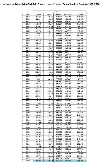
The graphical representation gives us the Graph of Total Mortalities between 1960-2020 in Spain, Italy, France, United Kingdom and Canada:
In this graph it can already be seen that similar countries in population have had unequal behaviors in the last 60 years. In this graph we observe something in common to the 5 countries, even having taken different paths, they have a positive balance of Mortality in the analyzed period, that is, in the 5 countries mortality has increased in the analyzed period, and the 5 are at historical highs (of the analyzed period). Be careful, this does not mean that it is good or bad, it is simply an objective data. It is significant for us as even having totally different intermediate behaviors in the 5 countries, in the end the long term is in charge of regulating or correcting the differences, in relation to Total Mortality.
We also find significant how the Mortalities of Spain, France and Italy are synchronized upwards from the year 2004 approximately. The United Kingdom joining this trend around 2011 approximately.
Canada has a similar behavior to that of Spain throughout the study period.
Next, we proceed to calculate the annual Mortality Rates for each country, using the data from the website www.macrotrends.net.
I leave here, for those who are interested, the sources and specific calculations made for each country in relation to the calculation of the Annual Total Mortality Rate between 1960 and 2020 in the following links:
With the data of the annual Total Mortality Rates for each country, the table of Total Mortality Rate (1960 - 2020) will be generated as a whole, as well as their respective graphs with the Total Mortality Rate as a whole for this period.
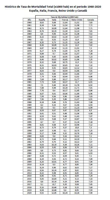
Comment on the Mortality Rate some interesting points:
- It is common to read that to compare Mortalities between countries it is better to use the Mortality Rate than the Mortality itself, since it includes the size of each population and can compare them appropriately. This is true, but it must be borne in mind that including the “population” factor, or more specifically the annual evolution of the annual population of a territory or a country, includes in itself other added concepts such as births as opposed to deaths as well as immigration as opposed to emigration. Elements that would require a more complex treatment and that we are not going to analyze in depth.
For this reason, we want to highlight that the Total Mortality graphs for the study of Mortality itself seem more reliable for the long term than the Mortality Rate itself, which has these added concepts.
In fact, as you can see in the graphs, the results of Mortality and Mortality Rate are usually very different, since they reflect these other concepts that we have mentioned.
- Another way to see how the Mortality Rate acts, would be understanding that if the rate of growth of mortality is adjustable to the rate of growth of the population of a country, the rate of mortality would be neutral or constant over time. Therefore, the Mortality Rate also measures how the growth of mortality varies in relation to the growth of the population of a country.
- In some way, the study in terms of Mortality Rate also means that Mortality variations are not directly appreciated, and the degree of detail obtained with the Mortality study is hardly reflected in the Mortality Rate itself, at least in the long-term study.
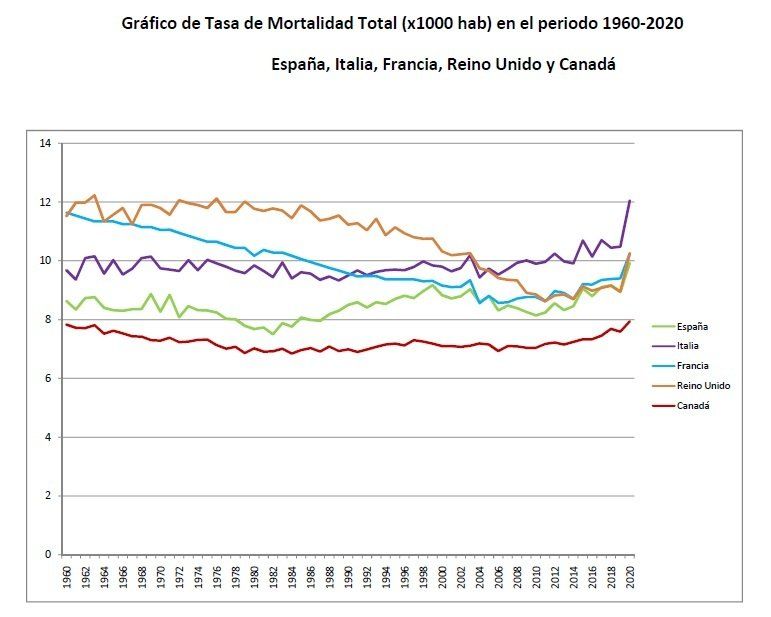
Analysis of the overall graph of the Total Mortality Rate in relation to the Total Mortality Rate:
There will be people who are experts in the field who can get more out of these graphs than we can, but we will try to provide a brief conclusion or common sense reasoning:
Regarding Spain: We see that the Mortality Rate in Spain has been quite lateral or neutral, until this last year 2020 in which it has reached the highest of the study period. Looking at its graph of Total Mortality, we see that it has been rising little by little until the mid-80s. From the 80s, mortality takes a more upward trend, currently standing at all-time highs (of the study period) by surpassing its previous maximum of 2018. Its population has grown fairly steadily over the past 60 years. This has meant that at times when Total Mortality did not grow much, the Total Mortality Rate decreased. And currently with a population that does not grow and with Total Mortality on the rise, the Mortality Rate will tend to rise.
Regarding Italy: Italy's Mortality Rate has been lateral or neutral until approximately 2015, since then it has made an upward lateral trend that has exploded upwards in 2020 with new historical highs (of the period analyzed) above of its precedent of 2017. Total Mortality began its upward trend in approximately 2005, currently being at all-time highs (of the period analyzed). Italy's population has grown almost steadily over the past 60 years although not much compared to other countries. This may have made the graphs of both Mortality and Mortality Rate not too different. Also the fact that the population in number is currently decreasing somewhat in Italy is helping to accelerate the Total Mortality Rate.
Regarding France: The Mortality Rate in France decreased until approximately 2005 to later make ground and develop an upward reaction, but contained (below previous highs). France's population has grown fairly steadily over the past 60 years. This has meant that when Mortality remained constant, the Mortality Rate decreased. In contrast, Total Mortality has been making maximum after maximum since 2015, and leaving Total Mortality this year 2020 at historical maximums (of the study period), having beaten its previous maximum of 2019.
Regarding the United Kingdom: The Mortality Rate in the United Kingdom decreased until approximately 2011 to later make ground and develop an upward reaction, but contained (below previous highs). France's population has grown fairly steadily over the past 60 years. This has meant that when Mortality remained constant, the Mortality Rate decreased. In contrast, Total Mortality has developed an upward trend since 2011, placing Total Mortality this year 2020 at historical highs (of the study period), having beaten its previous maximum of 1976.
Regarding Canada: The Death Rate in Canada has been fairly neutral from 1960 to the present. Being this year 2020 when it has rebounded, marking a historical maximum of the study period. If we look at Total Mortality, it has developed an upward trend during the study period. This situation is due to the fact that the population of Canada has grown steadily in the last 60 years, around 110%. This situation of annual Mortality and Population growth has meant that the Mortality Rate has remained fairly constant during the study period.
CTA Street Wear Blog

The absurdocracy could be defined as a new system of organization of the State in which good sense, reasoning and the precautionary principle in its policies, have been in the background overshadowed by a declaration of the Pandemic in 2020 by the WHO, which is used as an excuse to restrict / eliminate the rights of citizens at the same time that it allows the elaboration of new laws with which it is intended to perpetuate this situation of continuous Pandemic.
La absurdocracia se podría definir como un nuevo sistema de organización del Estado en el cual la sensatez, el raciocinio y el principio de precaución en sus políticas, han quedado en segundo plano eclipsados por una declaración de la Pandemia en 2020 por parte de la OMS, y que es utilizada como excusa para restringir/eliminar derechos de los ciudadanos a la vez que permite elaborar nuevas leyes con las que se pretende perpetuar esta situación de continua Pandemia.

We have set out to test the Ubuntu operating system, based on Linux, a little fed up with the continuous mandatory updates at the worst times and attracted by the security offered by an s.o. that hardly has a virus because it is less widespread among the average user.
Nos hemos propuesto probar el sistema operativo Ubuntu, en base Linux, un poco hartos de las continuas actualizaciones obligatorias en los peores momentos y atraídos por la seguridad que ofrece un s.o. que apenas tiene virus por ser menos generalizado entre el usuario medio.

Countries analyzed: Spain, Germany, Italy, United Kingdom, France, Sweden, Norway, Finland, Lithuania, Portugal, USA, Mexico, Russia, Canada, Japan, Chile, Australia.
Países analizados: España, Alemania, Italia, Reino Unido, Francia, Suecia, Noruega, Finlandia, Lituania, Portugal, EE.UU., México, Rusia, Canadá, Japón, Chile, Australia.

On 02-20-2021 We are all with Galicia - Manifestation in Santiago de Compostela.
Time to regain the spirit of cooperation and solidarity from the Prestige environmental catastrophe of 2002? Let's remember and compare.
El 20-02-2021 Todos estamos con Galicia - Manifestación en Santiago de Compostela.
¿Hora de recuperar el espíritu de cooperación y solidaridad de la catástrofe medioambiental del Prestige de 2002? Recordemos y comparemos.