


Group 1
Comparative Mortality Analysis by Country Groups -
Long Term Outlook
Group 1: Finland, Lithuania and Norway
With the data from the previous Post in relation to Total Mortality between 1960 and 2020 we make a joint table of Mortality between 1960 and 2020 for Finland, Lithuania and Norway:
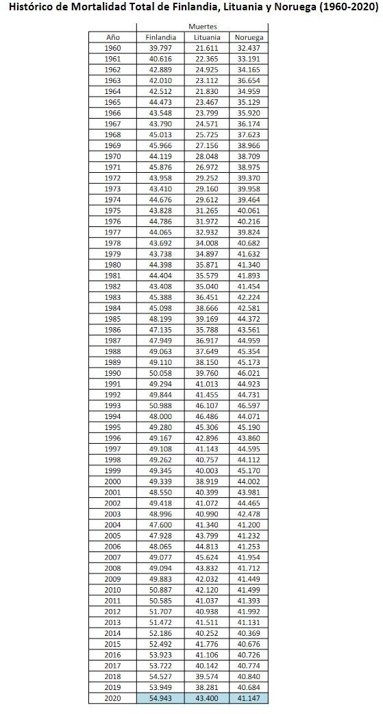
The graphical representation gives us the Graph of Total Mortalities between 1960-2020 in Finland, Lithuania and Norway:

In this graph it can already be seen that similar countries in population have had unequal behaviors in the last 60 years. It could be said that until the beginning of the 90s the three countries had similar growths (higher or lower), but from the beginning of the 90s, this has ceased to be the case. Be careful, this does not mean that it is good or bad, this is not so simple. But a similar behavior is significant up to some dates, and different from these dates with respect to Total Mortality.
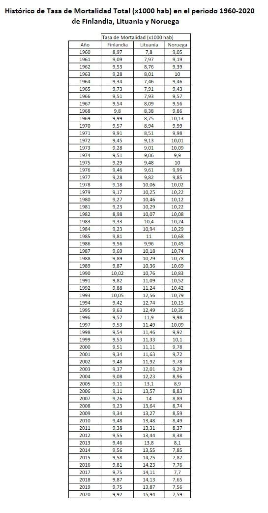
Next, we proceed to calculate the annual Mortality Rates for each country, using the data on the website www.macrotrends.net.
We leave here, for those who are interested, the annual Population graphs, the sources and specific calculations made for each country in relation to the calculation of the Annual Total Mortality Rate between 1960 and 2020 in the following links:
- Calculation of the annual Total Mortality Rate of Finland (pdf)
- Calculation of the Annual Total Mortality Rate of Lithuania (pdf)
- Calculation of the Annual Total Mortality Rate of Norway (pdf)
With the data of the annual Total Mortality Rates for each country, the table of Total Mortality Rate (1960 - 2020) will be generated as a whole, as well as their respective graphs with the Total Mortality Rate as a whole for this period.
Comment on the Mortality Rate some interesting points:
- It is common to read that to compare Mortalities between countries it is better to use the Mortality Rate than the Mortality itself, since it includes the size of each population and can compare them appropriately. This is true, but it must be taken into account that including the “population” factor, or more specifically the annual evolution of the annual population of a territory or a country, includes in itself other added concepts such as births as opposed to deaths as well as immigration as opposed to emigration. Elements that would require a more complex treatment and that we are not going to analyze in depth.
For this reason, we want to emphasize that the Total Mortality graphs for the study of Mortality itself seem more reliable for the long term than the Mortality Rate itself, which has these added concepts. In fact, as you can see in the graphs, the results of Mortality and Mortality Rate are usually very different, since they reflect these other concepts that we have mentioned.
- Another way of reading how the Mortality Rate works would be to understand that if the rate of mortality growth has a specific proportion to the rate of growth of the population of a country, the mortality rate would be neutral or constant over time. Therefore, the Mortality Rate also measures how the growth of mortality varies in relation to the growth of the population of a country.
- Somehow the study in terms of the Mortality Rate also makes the Mortality variations not appreciated so clearly, and the degree of detail obtained with the Mortality study is hardly reflected in the Rate itself. Mortality, at least in the long-term study.
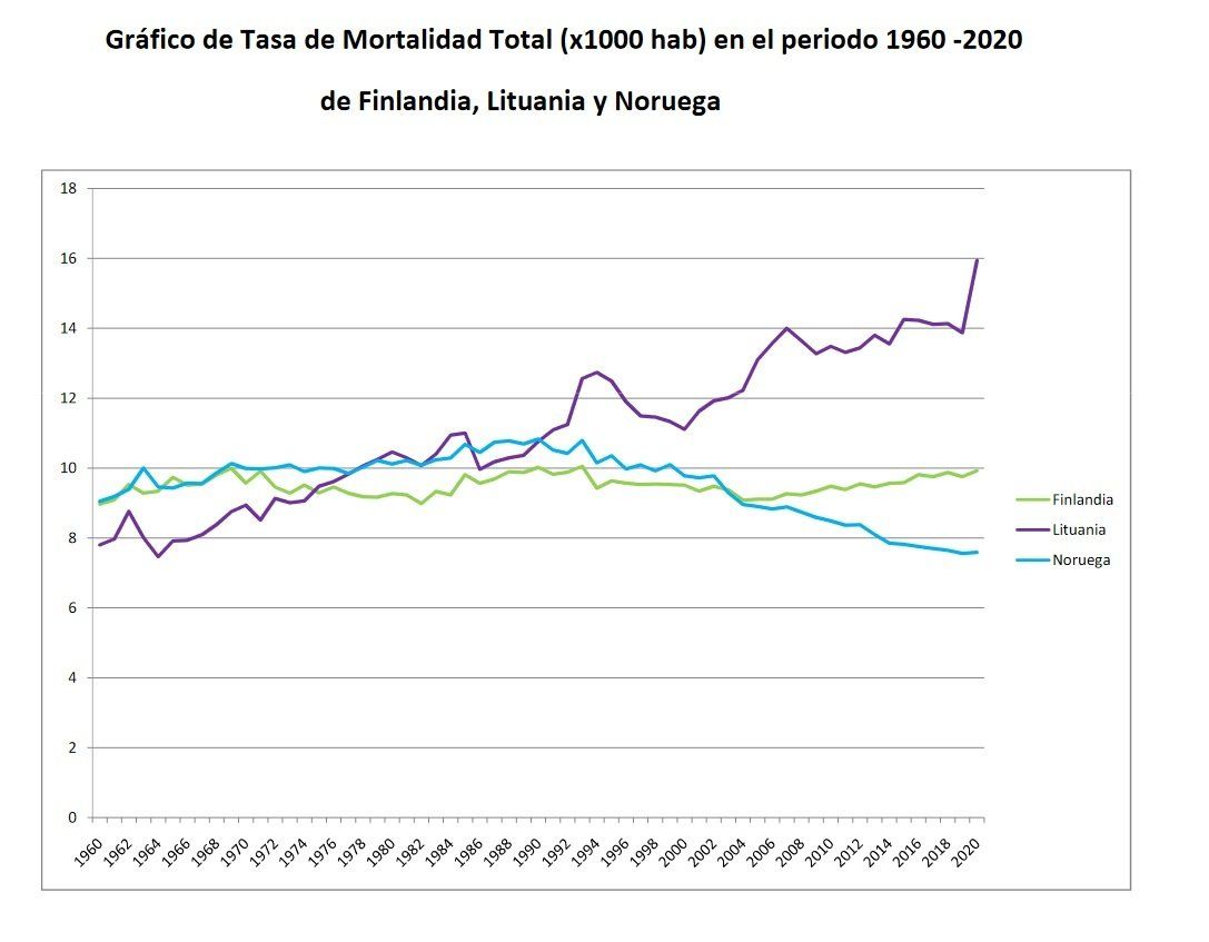
Analysis of the overall graph of the Total Mortality Rate in relation to the Total Mortality Rate:
There will be people who are experts in the field who can get more out of these graphs than we can, but we will try to provide a brief conclusion or common sense reasoning:
Regarding Finland: We see that the Mortality Rate in Finland is quite lateral or neutral. Its population has grown somewhat, so it seems to indicate that it has a synchronized rhythm between mortality and population. In terms of mortality, on the contrary, Finland has just exceeded its previous annual maximum of 2018, so it is at all-time highs (of the period analyzed).
Regarding Norway: Norway's Mortality Rate has dropped since the early 1990s. Also since then, Total Mortality has declined as the country's population grows. In principle, it seems a fairly contained situation in relation to Total Mortality and Total Mortality Rate.
Regarding Lithuania: The upward graph of the Mortality Rate in Lithuania in comparison to Finland and Norway is surprising. We believe that this may be due to the fact that there has been a significant emigration of young people from the country since the early 1990s that has led to negative annual population growth (see graph of Population of Lithuania), following the older population dying at a normal rate That is why the population is reduced, and the Mortality Rate is triggered. In contrast, we see in its corresponding graph that the Total Mortality of Lithuania is contained for the moment (below its previous maximums), unlike in Finland.
CTA Street Wear Blog

The absurdocracy could be defined as a new system of organization of the State in which good sense, reasoning and the precautionary principle in its policies, have been in the background overshadowed by a declaration of the Pandemic in 2020 by the WHO, which is used as an excuse to restrict / eliminate the rights of citizens at the same time that it allows the elaboration of new laws with which it is intended to perpetuate this situation of continuous Pandemic.
La absurdocracia se podría definir como un nuevo sistema de organización del Estado en el cual la sensatez, el raciocinio y el principio de precaución en sus políticas, han quedado en segundo plano eclipsados por una declaración de la Pandemia en 2020 por parte de la OMS, y que es utilizada como excusa para restringir/eliminar derechos de los ciudadanos a la vez que permite elaborar nuevas leyes con las que se pretende perpetuar esta situación de continua Pandemia.

We have set out to test the Ubuntu operating system, based on Linux, a little fed up with the continuous mandatory updates at the worst times and attracted by the security offered by an s.o. that hardly has a virus because it is less widespread among the average user.
Nos hemos propuesto probar el sistema operativo Ubuntu, en base Linux, un poco hartos de las continuas actualizaciones obligatorias en los peores momentos y atraídos por la seguridad que ofrece un s.o. que apenas tiene virus por ser menos generalizado entre el usuario medio.

Countries analyzed: Spain, Germany, Italy, United Kingdom, France, Sweden, Norway, Finland, Lithuania, Portugal, USA, Mexico, Russia, Canada, Japan, Chile, Australia.
Países analizados: España, Alemania, Italia, Reino Unido, Francia, Suecia, Noruega, Finlandia, Lituania, Portugal, EE.UU., México, Rusia, Canadá, Japón, Chile, Australia.

On 02-20-2021 We are all with Galicia - Manifestation in Santiago de Compostela.
Time to regain the spirit of cooperation and solidarity from the Prestige environmental catastrophe of 2002? Let's remember and compare.
El 20-02-2021 Todos estamos con Galicia - Manifestación en Santiago de Compostela.
¿Hora de recuperar el espíritu de cooperación y solidaridad de la catástrofe medioambiental del Prestige de 2002? Recordemos y comparemos.