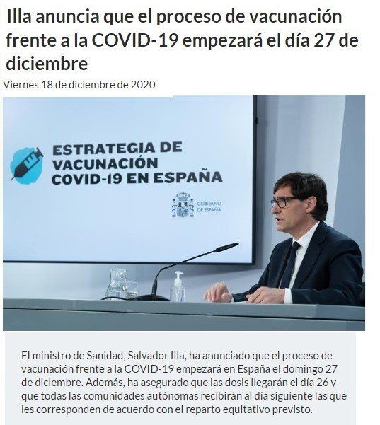
We have been vaccinating for about a month and a half with these new generation vaccines and we already have data to verify how the intended immunization is going as well as mortality in the Spanish population. Recall that it was last 27th of December, 2020, when vaccination began in Spain against COVID-19, as can be seen in the Moncloa statement, of which I leave the corresponding link.
To analyze this start of vaccination in Spain, we will use the Contagion and Mortality graph that the digital newspaper El Confidencial has been making (www.elconfidencial.com) since the beginning of the Pandemic, and with which we can get a fairly clear idea of the photo or pre-vaccination moment, assuming as a premise the veracity of the data, not from El Confidencial, but the official ones, of course.
Let's get to it:
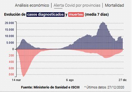
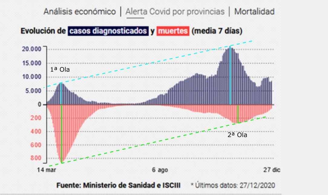
Pre-vaccination photo:
This is the graph from 14thof March, 2020 to 27th of December, 2020, both for Contagions (in blue) and Deaths (in pink), the latter in reverse (increasing from horizontal down). As we can see in the "1st Wave" the infections were few and the deaths many, and in the "2nd Wave" the infections were many more (probably due to more PCR tests), however the deaths were much lower than in the " 1st Wave ”.